Case study 02 · Campus marketing and design
From a clip‑arttemplate toa chapter lookin one semester.
I’m VP of Marketing for ALPFA at UW–Whitewater. I run the chapter’s social media, design every flyer and build the decks for our events. My first flyers looked like everyone else’s. By November, they looked like one brand.
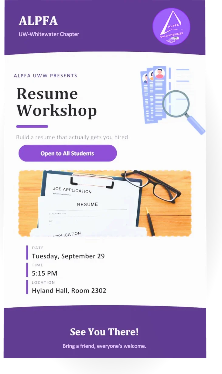
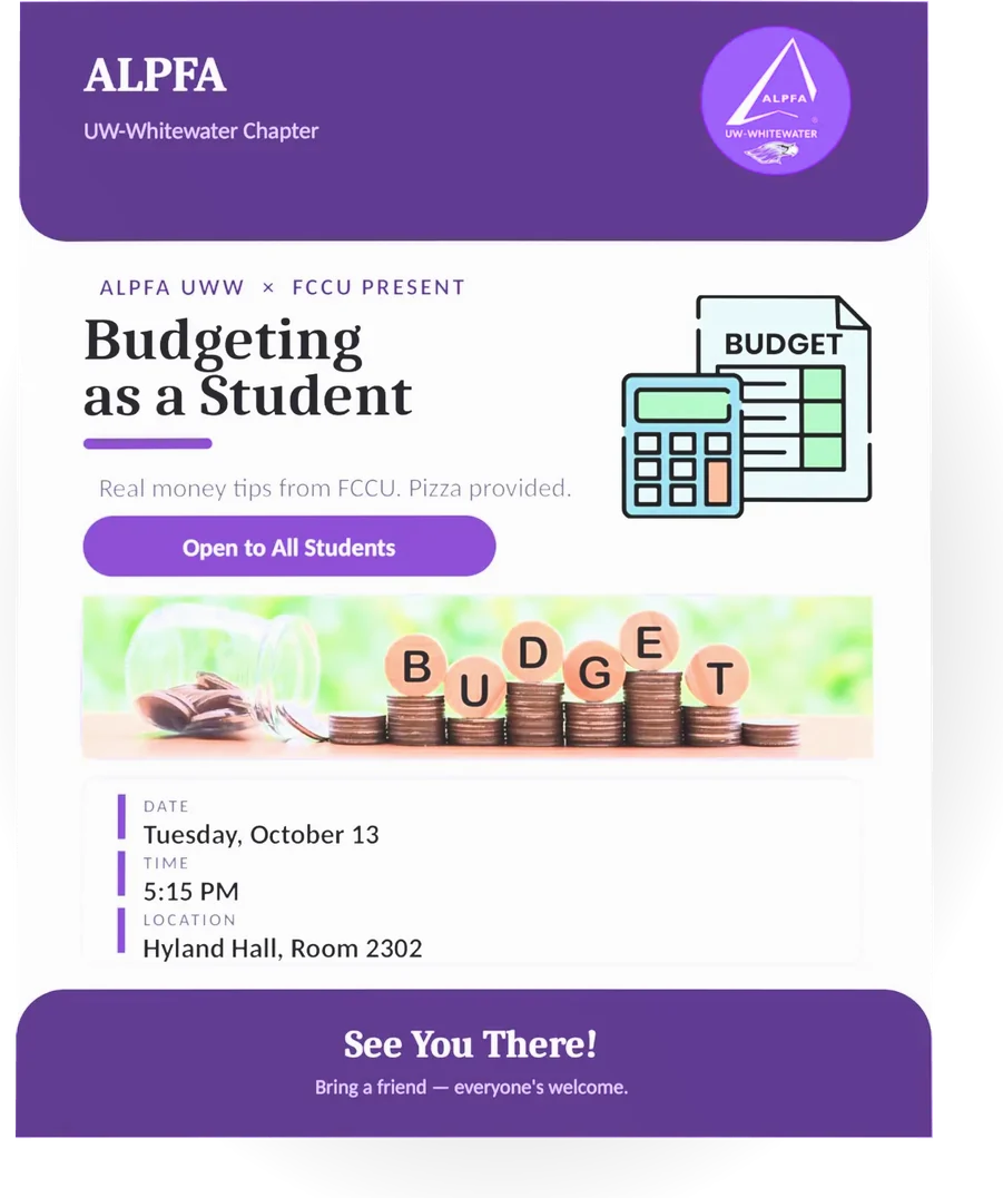
BeforeSeptember
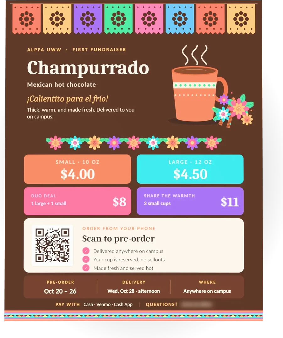
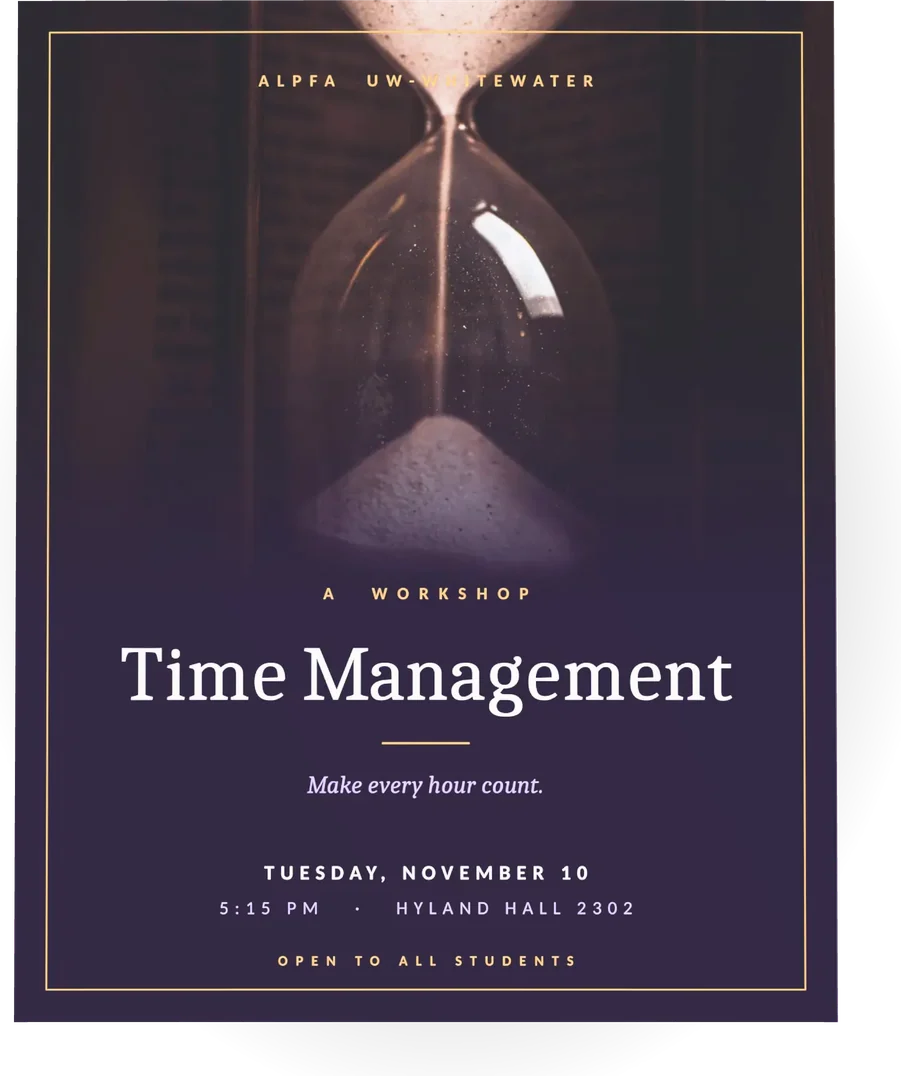
AfterOctober to November
01Context
A new chapter has to fightevery club for attention.
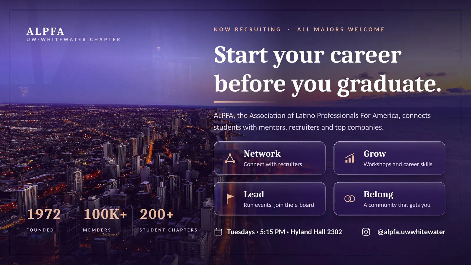
ALPFA (Association of Latino Professionals For America) helps students get ready for business careers. Our chapter started its activity in September.
Students get flyers from dozens of groups every week. If a flyer looks thrown together, students assume the event is too.
My job had three parts: keep a steady presence online, make events look worth an evening, and help raise money for chapter activities, working with our treasurer.
I post on a schedule the chapter can keep: one strong post every two weeks, instead of bursts and silence.
02My role
I own the chapter’s lookand its message.
I use design and AI tools to work faster. The decisions about what to say, what to show and when to post are mine.
What I did
- Designed every chapter flyer, fundraiser promos included.
- Ran social media on a two-week posting rhythm.
- Researched topics and built the decks for chapter events.
- Proposed the buy-one-get-one offer and a Google Form for orders, with the treasurer.
- Kept good relations with other student organizations.
What tools did
- Templates gave me a starting layout in September. I outgrew them by October.
- AI tools helped with research and first drafts of slides and layouts. I chose the direction and approved every piece.
- A Google Form handled fundraiser pre-orders.
03 · Process
What I changed betweenSeptember and November.
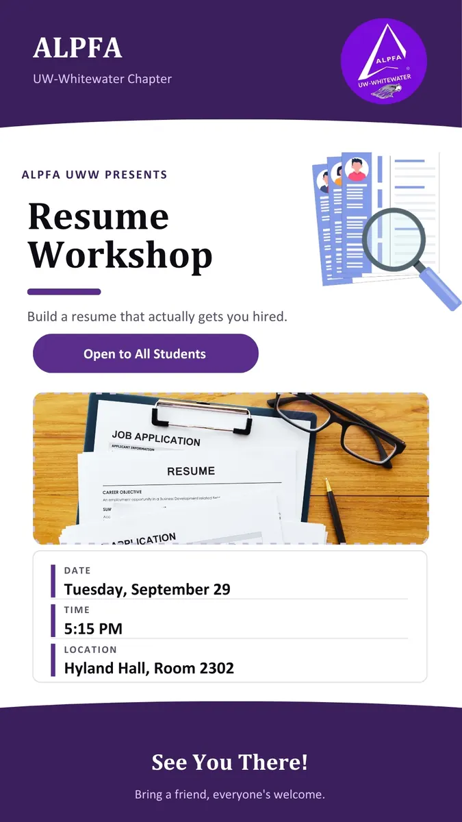
Next to my newer work, the September flyers show the problem clearly: too many things fighting for the eye.
 Before · Sep
 After · Nov
One hero image.
Early flyers stacked clip art, a stock photo and five boxes. Now each piece has one image or one idea.
Type does the work.
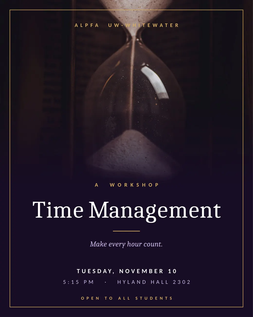
A serif headline, one size jump, and short lines. The title should land before anything else.
Match the mood to the event.
Warm papel picado for a Mexican hot chocolate sale. A quiet hourglass for a talk about time.
Make the next step easy.
Prices you can read from across a hallway, and a QR code to pre-order on the spot.
04 · The work: fundraiser
Champurrado: a sale you can read in two seconds.
For the chapter’s Mexican hot chocolate fundraiser, I proposed a buy-one-get-one offer and a pre-order form, then designed the promotion around them.
- The offer leads. Prices sit in big color blocks, so the deal is the first thing you see after the name.
- The culture is the design. Papel picado and marigolds say what champurrado is to students who already know it, and invite the ones who don’t.
- Ordering takes one scan. The QR code goes straight to the pre-order form. Dates, delivery and payment sit in one strip at the bottom.
Not claimedI don’t have sales totals, so I don’t state any.
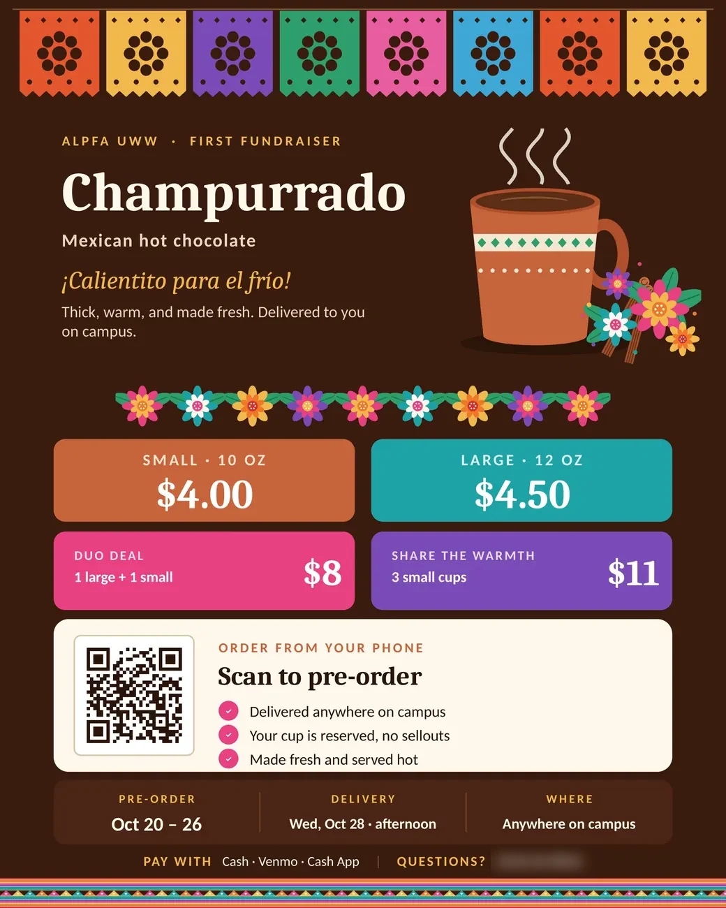
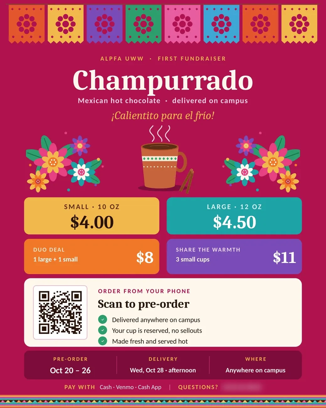
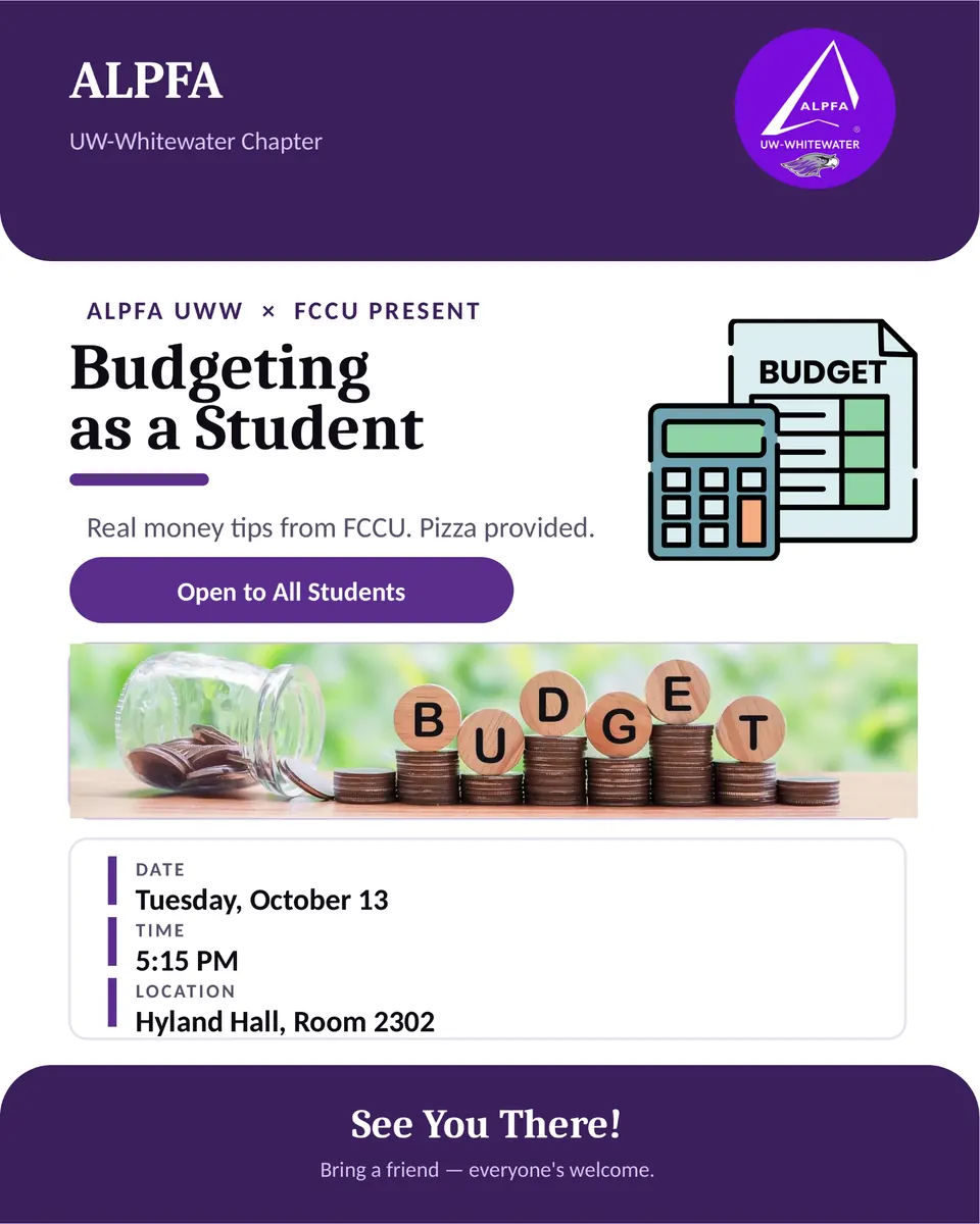
01 / 05 · Oct · Champurrado fundraiser
The buy-one-get-one offer I proposed, with a Google Form for pre-orders behind the QR code. The chapter ran it.
Five chapter flyers. Use the Prev and Next buttons or the left and right arrow keys to move through them. You can also drag the top sheet away.
05 · The work: event decks
Workshop decks, builtfrom my own research.
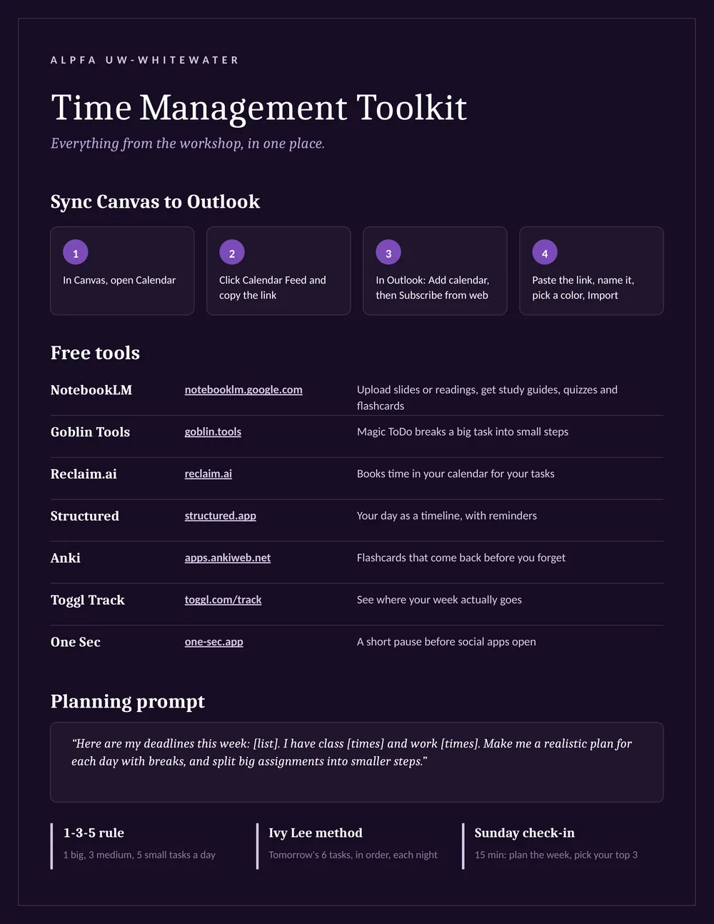
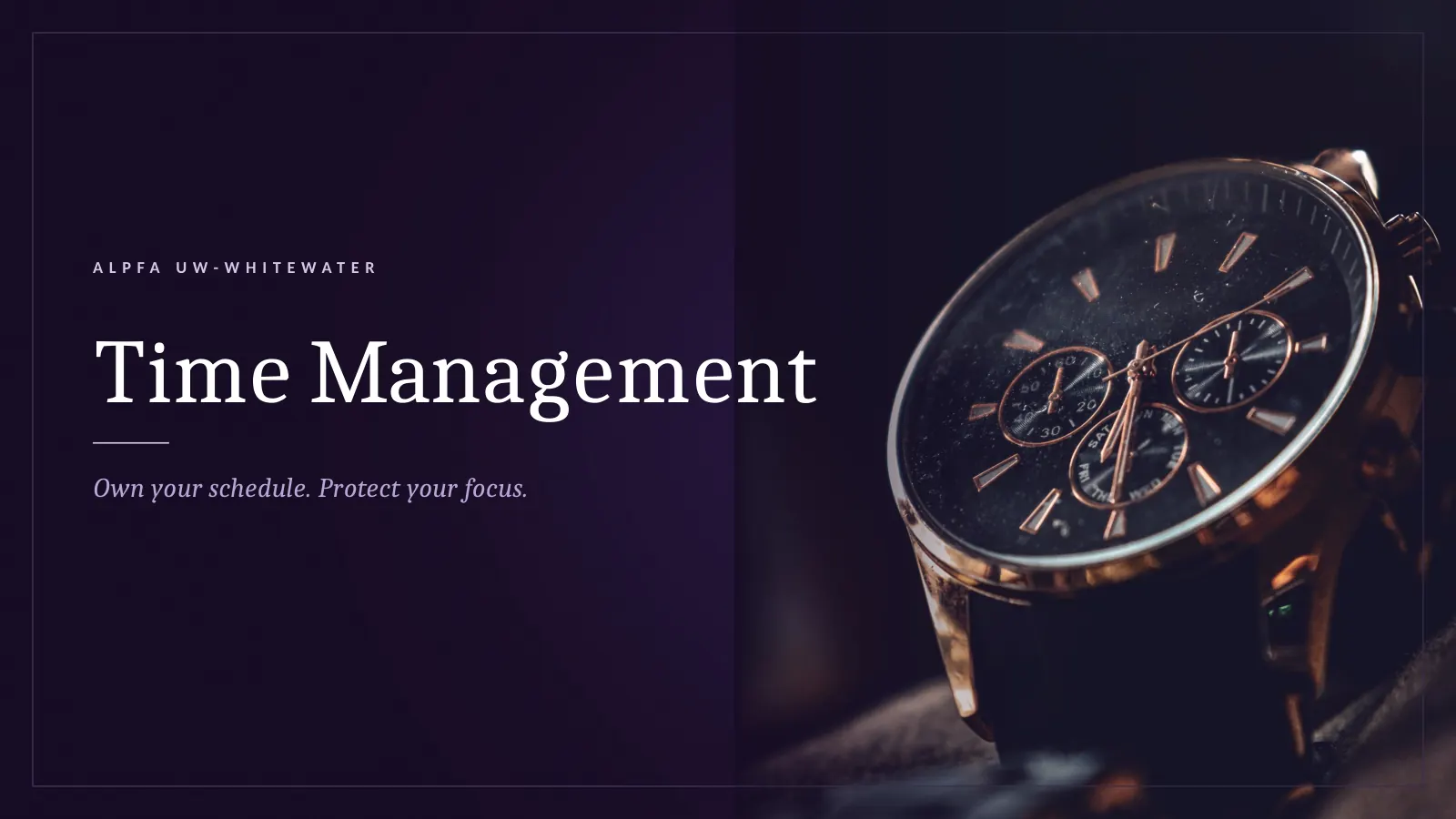
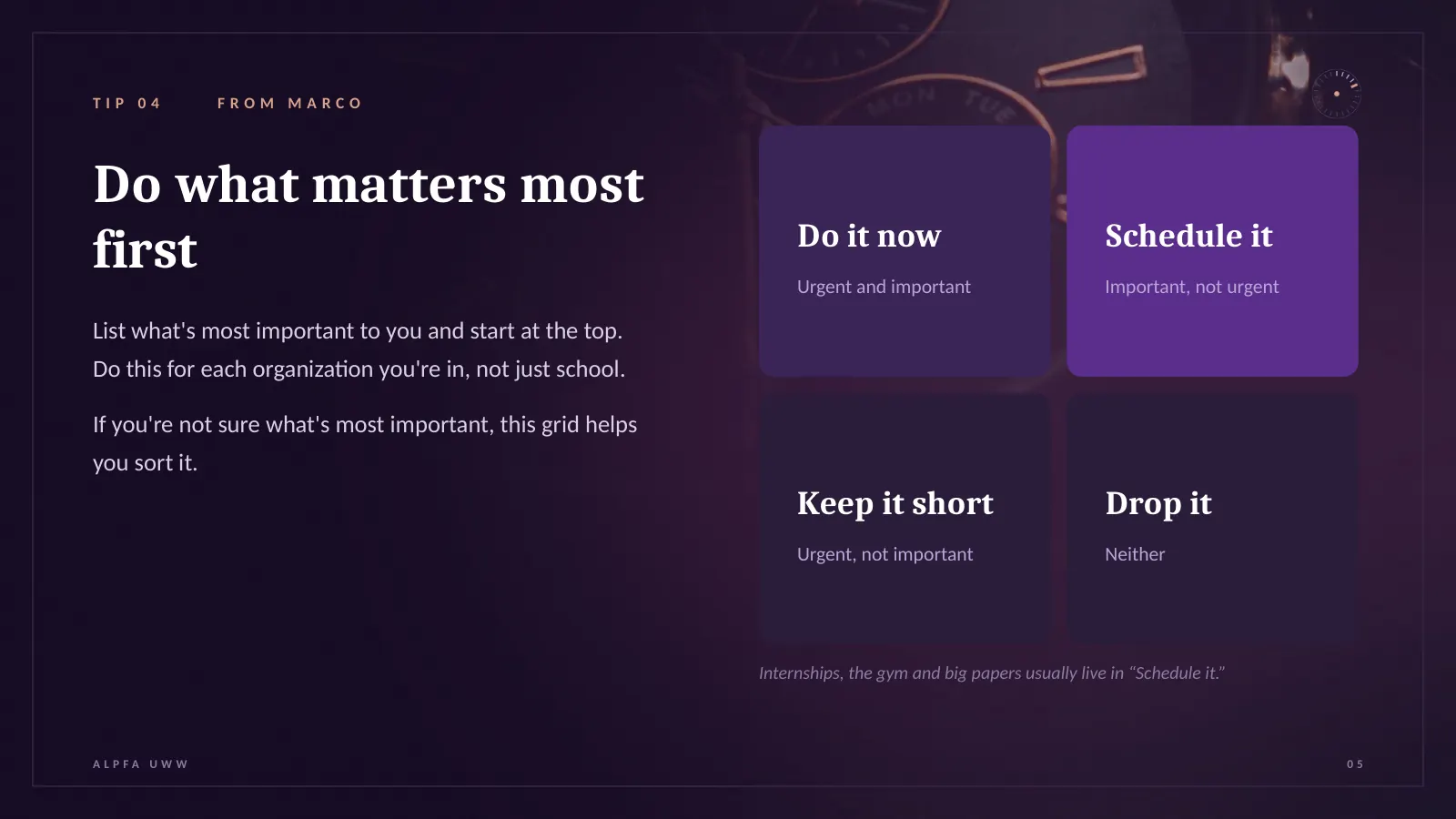
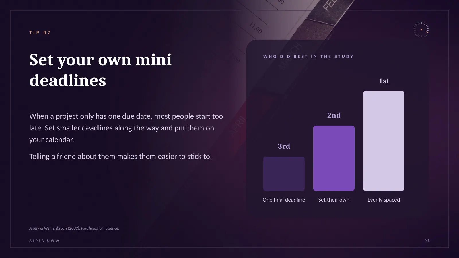
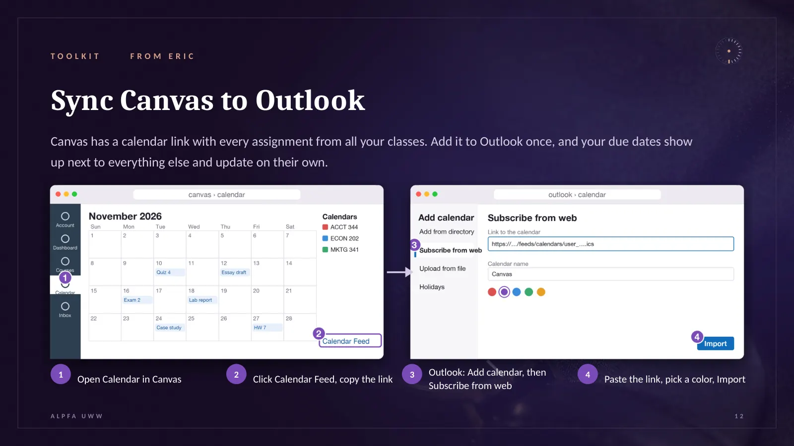
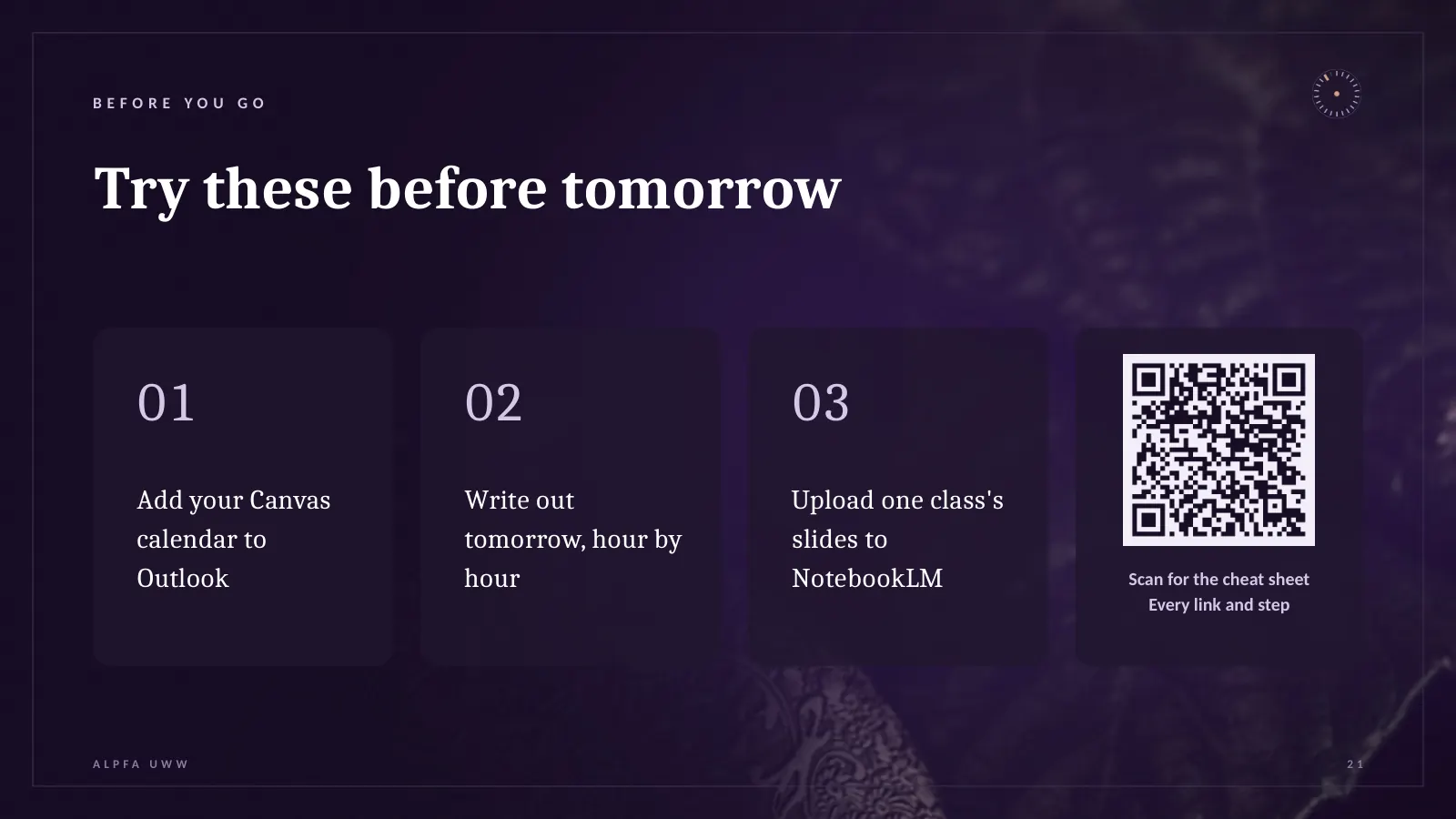
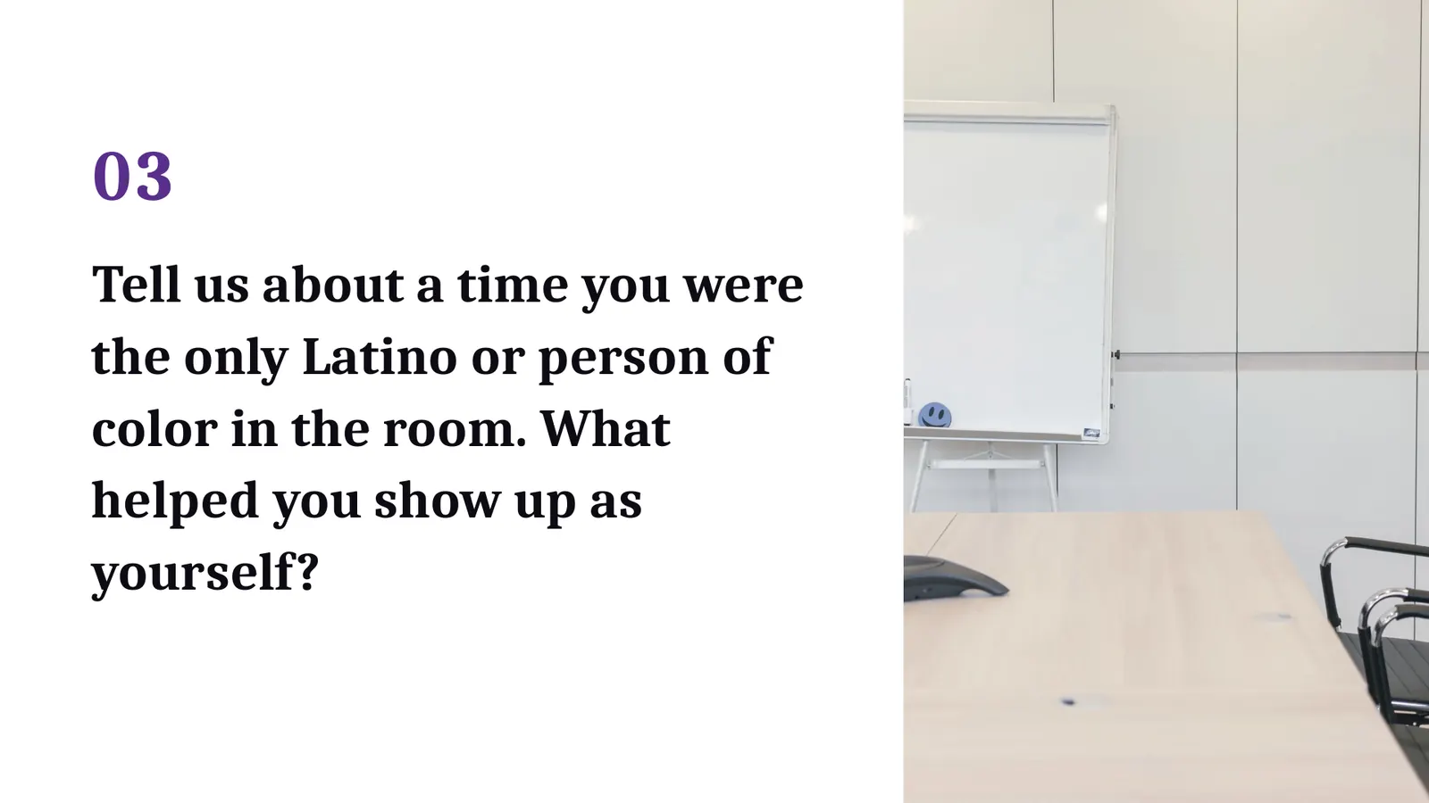
For the Time Management workshop I researched the topic and built a 22-slide deck: habits first, then a toolkit of free apps, then three things to try before tomorrow. Drag to look through it →
Concept · poster system
Four words, two languages,one system.
The four words come from our recruitment slide: Network, Grow, Lead, Belong. Each poster gets a color, a cut-paper motif and its Spanish pair, so students can tell it’s ALPFA from across the hallway. Not printed yet.
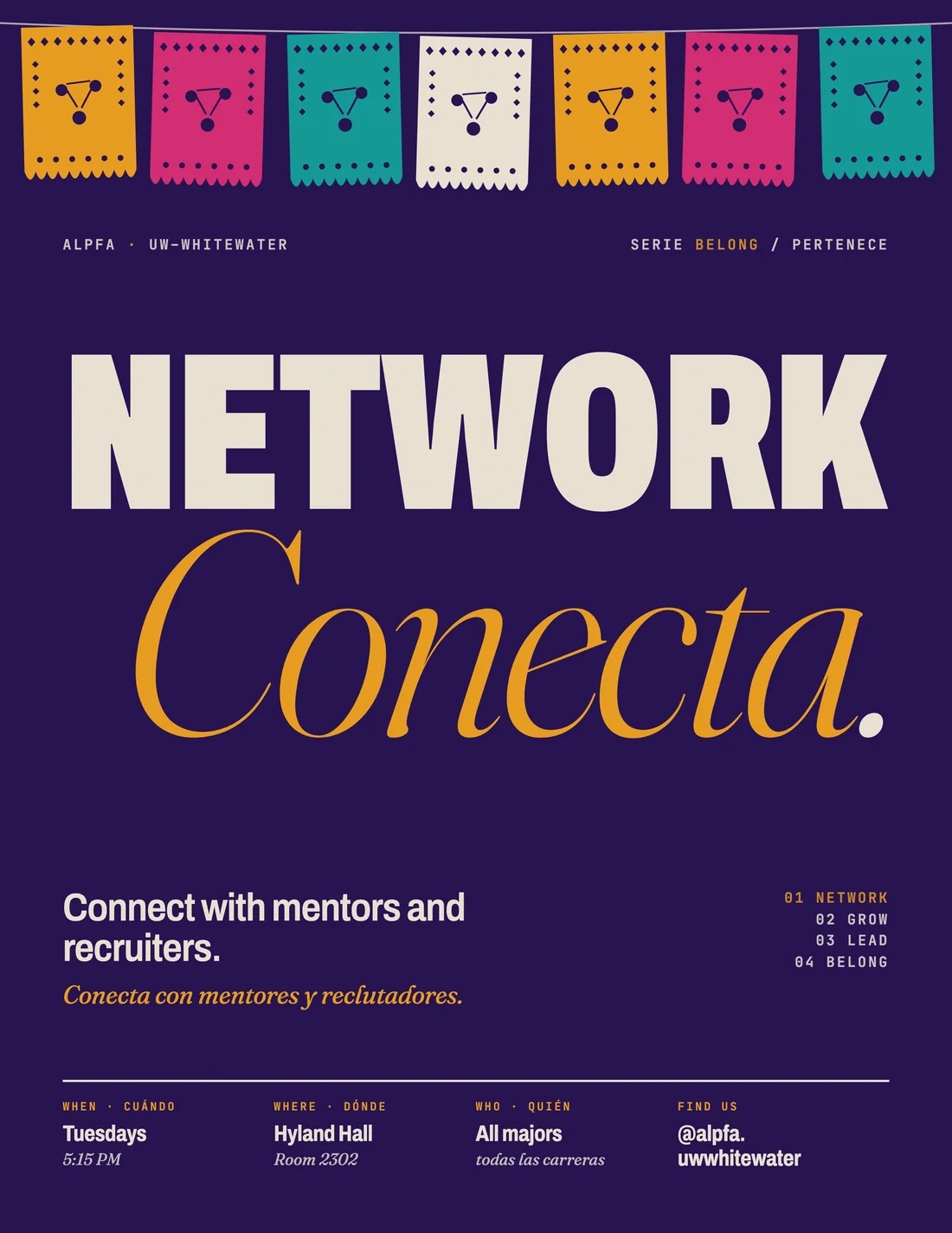
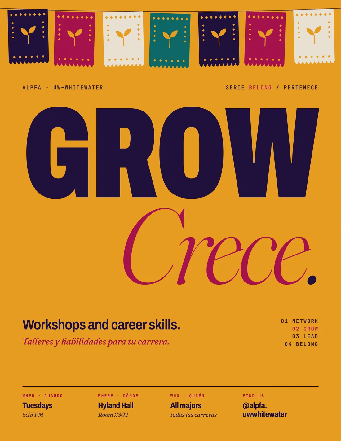
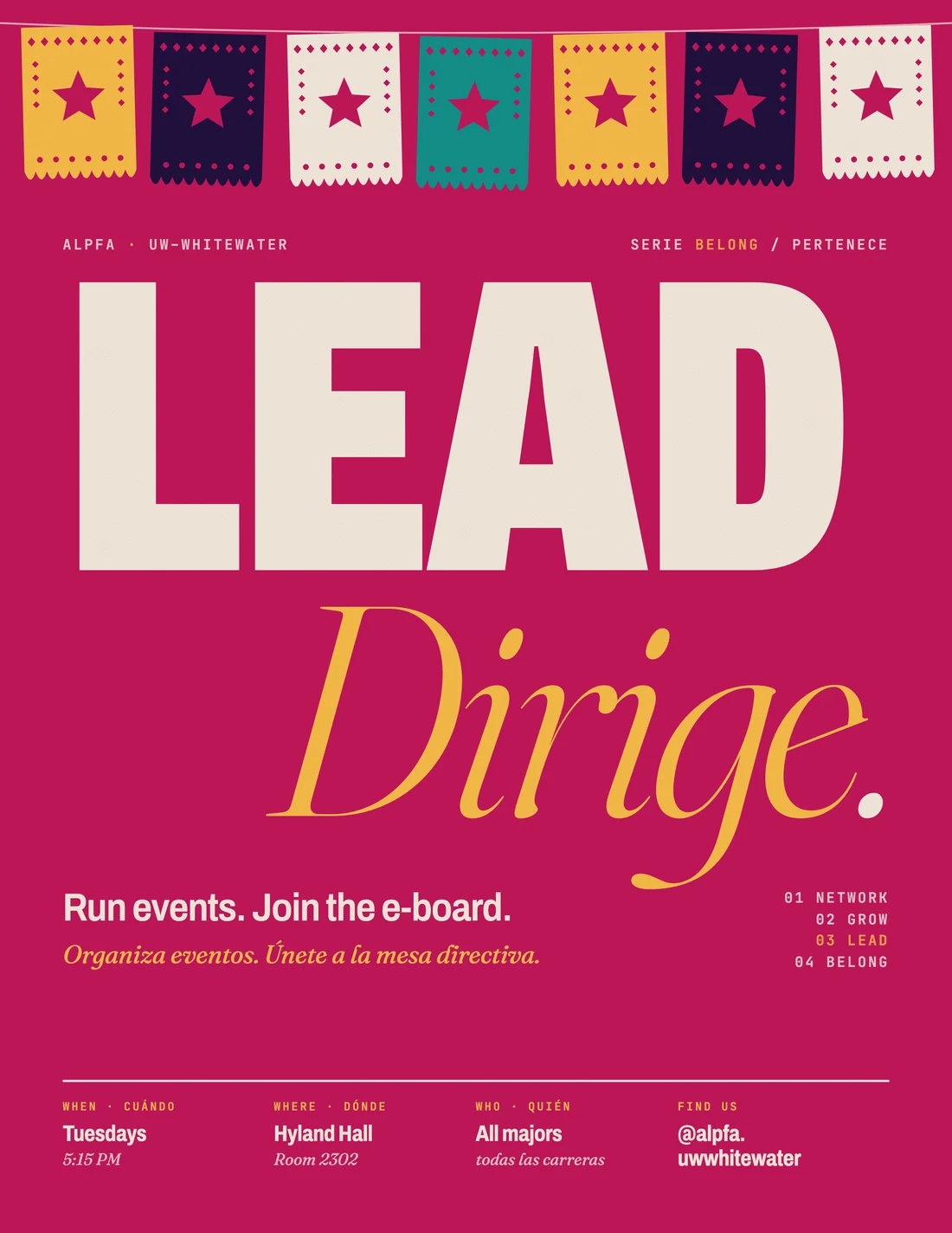
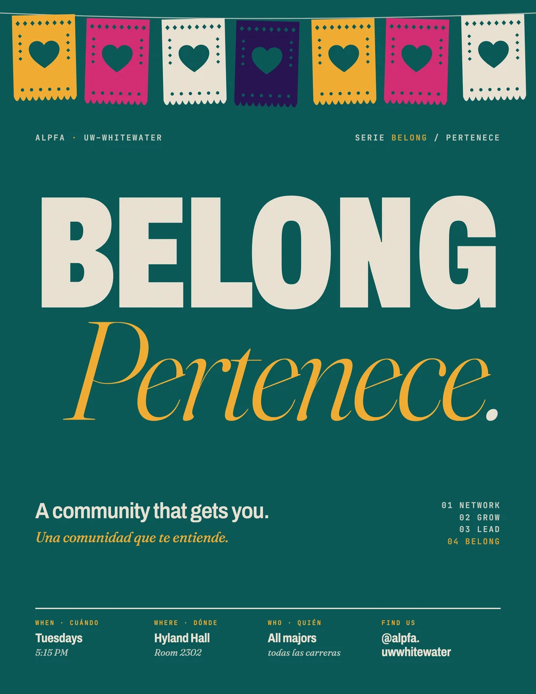
Why a system: one grid, one type pair, four colorways. The next poster is a quick edit, and it still looks like the chapter.
06 · Results
The numbers I have,and the ones I don’t.
Not measured yetEvent turnout and fundraiser revenue. I don’t have those numbers, so I don’t claim them.
07What’s next
Next: measure whateach post brings in.
- One sign-up form per event, linked from the post, so I can tell which posts bring people in the door.
- Count turnout and sales with the treasurer, so the next fundraiser has a number to beat.
- Turn the look into a kit: templates and rules, so the next VP keeps the brand without starting over.
What I learned
Most of my design progresscame from taking things out.
And a schedule the chapter can keep beats a burst of posts. One good post every two weeks adds up.